What extraction graphs reveal about your tamping technique
For the dedicated manual espresso enthusiast, the pursuit of the perfect shot is a journey of continuous refinement. We obsess over grind size, dose, and temperature, but the physical act of tamping often remains a matter of feel. While a practiced hand is invaluable, modern espresso machines and third-party applications provide a powerful diagnostic tool: the extraction graph. By visualizing pressure, flow, and volume over time, these graphs offer an objective look into the coffee puck’s integrity. More specifically, they provide direct, actionable feedback on the quality and consistency of your tamping technique, turning abstract data into a clear guide for improvement.
Understanding the anatomy of an extraction graph
Before diagnosing flaws, it is essential to understand what a typical extraction graph displays. While interfaces vary, most graphs track a few key variables in real time. Pressure (measured in bars) shows the force exerted on the coffee puck, while flow rate (measured in ml/s) shows how quickly water is passing through it. These two metrics are often plotted against time, providing a narrative of the entire extraction process. A well-constructed shot will display predictable, smooth curves through its distinct phases: pre-infusion, pressure ramp, peak extraction, and the final pressure decline.
| Metric | Unit | What It Reveals |
|---|---|---|
| Pressure | bars | The resistance provided by the coffee puck against the water. |
| Flow Rate | ml/s | The speed at which water passes through the puck. |
| Time | seconds | The duration of the extraction phases. |
| Volume | ml | The total liquid espresso yield. |
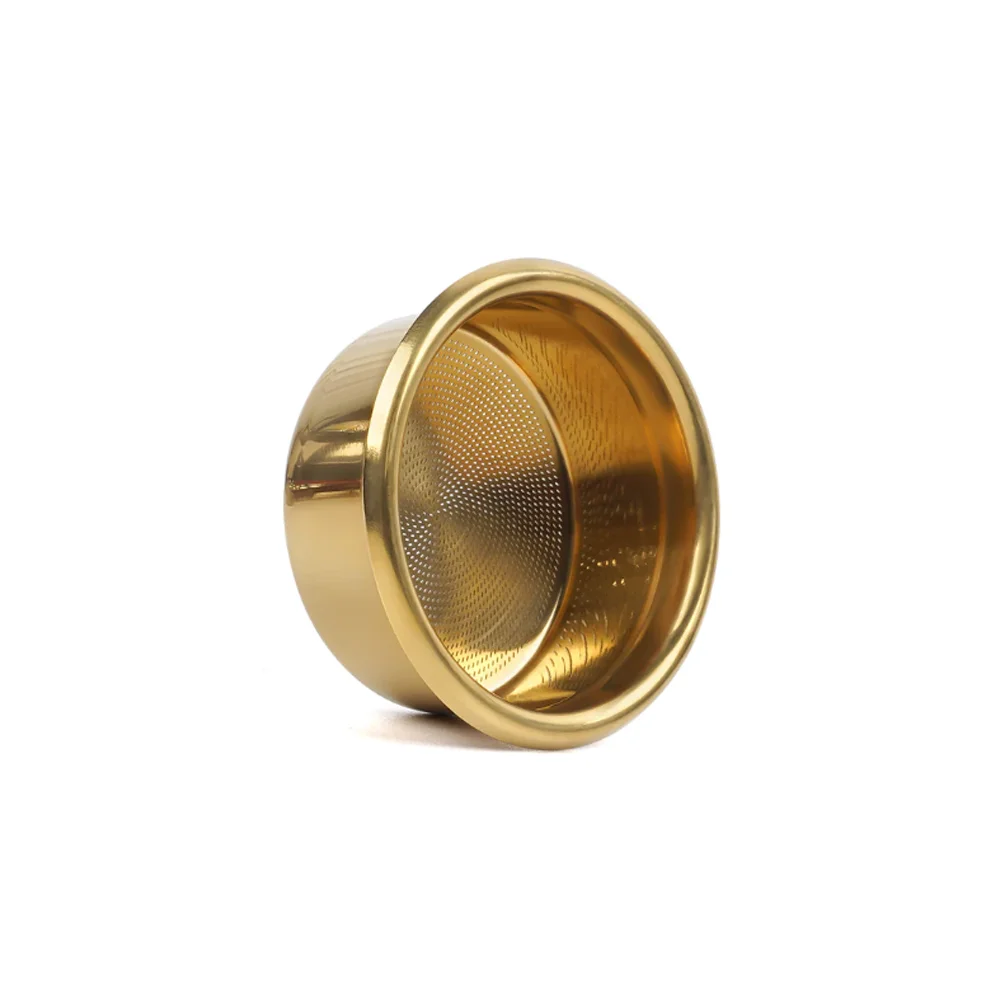
The signature of a textbook tamp
In an ideal extraction, the graph tells a story of uniformity. After a gentle pre-infusion, the pressure curve will ramp up smoothly and hold steady at your target (e.g., 9 bars). Correspondingly, the flow rate will begin slowly and then stabilize, indicating that water is saturating the puck evenly and finding consistent pathways through the coffee grounds. There are no sudden peaks or troughs. This visual stability is the hallmark of a well-prepared puck, one that has been distributed evenly and tamped with level, adequate force. It signifies that you have created a homogenous puck with consistent density, promoting a balanced and full-flavored extraction.
How tamping errors manifest in the data
An imperfect tamp disrupts the uniform resistance of the puck, and the graph will display these disruptions with unflinching accuracy. The most common tamping error is channeling, where water finds a path of least resistance and erodes a small channel through the puck. On a graph, this appears as a sudden, sharp increase in the flow rate, coupled with a simultaneous, equally sharp drop in pressure. The machine is suddenly able to push water through the puck far too easily, which bypasses the majority of the coffee grounds and leads to a thin, under-extracted, and sour shot.
An uneven tamp, where one side of the puck is more compressed than the other, produces a more subtle but still identifiable signature. The pressure curve may struggle to reach and hold its peak, showing minor fluctuations as water saturates the less-dense areas first. This can create small, localized channels that are not catastrophic but still prevent a perfectly even extraction. The shot may taste acceptable, but the graph reveals an underlying inconsistency that is holding back its full potential.
From diagnosis to practical adjustment
The true value of an extraction graph lies in its ability to guide your adjustments. If your graphs consistently show the tell-tale signs of channeling—the sudden flow spike and pressure drop—it is a clear indicator that your puck preparation needs attention. Focus on improving your distribution before tamping to break up clumps and create a more homogenous bed of coffee. From there, ensure your tamping is perfectly level. Use your fingertips to gauge the distance between the tamper base and the basket rim to ensure it is even all the way around.
If the graph shows a very slow ramp to pressure and a restricted flow rate, you may be tamping with too much force for your grind size, choking the machine. Conversely, a graph that shows pressure struggling to build at all suggests a tamp that is too light, offering little resistance. The graph provides the feedback, allowing you to connect a specific outcome with a physical action.
Conclusion
For the advanced home barista, extraction graphs elevate puck preparation from an art based on feel to a science informed by data. By learning to read the signatures of pressure and flow, you can gain a deeper understanding of what is happening inside the portafilter. These graphs reveal the consequences of an uneven or improperly compressed tamp, providing the objective feedback needed to refine your technique shot after shot. Ultimately, this data-driven approach removes guesswork, helping you build the muscle memory required for consistent, exceptional espresso. For those seeking to improve their technique, a range of precision espresso tools is available from retailers like papelespresso.com.


 No products in the cart.
