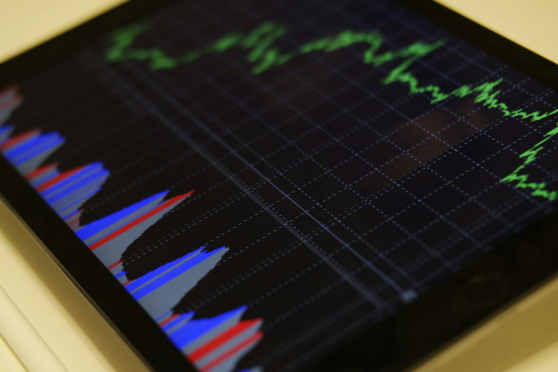
The Gaggiuino project transforms a classic home espresso machine into a powerful tool with capabilities rivaling commercial equipment. At the heart of this upgrade is the ability to see precisely what’s happening during extraction via pressure and flow graphs. For newcomers, this data can look like a complex, inscrutable scribble. However, these graphs are the key to unlocking consistent, delicious espresso. They provide a visual story of your shot, allowing you to move beyond guesswork and start making targeted, data-driven adjustments. This guide will demystify these charts, teaching you how to read the lines, interpret the patterns, and use the information to diagnose issues and perfect your espresso profiling.
Understanding the basics of the graph
Before diving into complex analysis, it’s essential to understand the fundamental components of your Gaggiuino graph. Think of it as a map of your espresso shot, with each line telling a different part of the story. Typically, you will see two primary lines plotted against time.
The horizontal axis, or X-axis, always represents time, measured in seconds. The shot begins at zero on the left and progresses to the right.
The vertical axes, or Y-axes, represent the two key variables:
- Pressure: Usually shown in blue, this line tracks the pressure inside the group head in bars. It shows you how much force the machine is applying to the coffee puck.
- Flow: Often represented in red, this line measures the rate at which water is flowing through the coffee puck, typically in milliliters per second (ml/s).
A typical espresso shot profile will show distinct phases on the graph. It starts with pre-infusion, where pressure and flow are low to gently saturate the puck. This is followed by the pressure ramp, where pressure and flow increase toward their target. The main extraction phase, or peak pressure, is where the machine holds a target pressure. Finally, you may see a ramp-down, where pressure is gradually reduced to finish the shot. Understanding these stages is the first step to interpreting the story your shot is telling you.
Deciphering the pressure profile
The pressure profile is your window into what the machine is doing. It shows the force applied over time and is the variable you most directly control with your Gaggiuino profile settings. A clean, well-executed shot will have a pressure line that looks smooth and intentional, closely matching the profile you’ve programmed.
Deviations from this ideal can indicate problems. For example, if the pressure line is jagged or spiky, it could point to air in your system or inconsistent pump performance. If the pressure fails to reach its target, it’s a classic sign that your coffee grind is too coarse. The water is flowing through the puck so easily that it can’t build up enough resistance to create the desired pressure. Conversely, if the pressure ramps to its maximum setting and stays there but your flow is near zero, your grind is likely too fine, effectively “choking” the machine.
The shape of the profile itself has a huge impact on taste. A traditional “flat 9-bar” profile is great for developing body and rich crema. In contrast, a profile with a long, low-pressure pre-infusion followed by a gentle ramp and a slow decline in pressure can highlight delicate, acidic notes, which is ideal for lighter roasts.
Analyzing the flow rate graph
If the pressure graph shows what the machine is doing, the flow graph shows how the coffee puck is reacting. This is where you can truly diagnose the quality of your puck preparation. The flow rate is a direct consequence of the pressure applied and the resistance offered by the coffee. An ideal flow graph shows a very low, controlled flow during pre-infusion, indicating the puck is saturating evenly. As the pressure ramps up, the flow should increase smoothly and then stabilize during the main extraction phase.
The most common and frustrating issue revealed by the flow graph is channeling. This occurs when water finds a path of least resistance through the puck, leading to uneven extraction. On the graph, channeling appears as a sudden, sharp spike in the flow rate. You will almost always see a corresponding dip in the pressure graph at the same moment, as the sudden loss of resistance makes it impossible for the machine to maintain its target pressure. This is a clear sign that you need to improve your puck preparation, focusing on distribution (using a WDT tool) and consistent tamping.
Other flow-related issues are more straightforward. A consistently high flow rate throughout the shot confirms that your grind is too coarse. A very low, trickling flow rate that takes a long time to produce any yield means your grind is too fine.
Putting it all together: A practical guide to shot diagnosis
The true power of Gaggiuino comes from reading the pressure and flow graphs together. One informs the other, giving you a complete picture of the extraction. For example, a drop in pressure alone could mean many things, but when you see it happen at the exact same time as a spike in flow, you can be certain you’re dealing with channeling. By correlating these data points with the taste in your cup, you can make precise adjustments.
Here is a table of common scenarios to help you diagnose your shots:
| Scenario | Graphical Signature | Likely Cause | Solution |
|---|---|---|---|
| The Perfect Shot | Smooth pressure curve matching the target. Low, stable flow in pre-infusion, rising to a steady rate during extraction. | Correct grind size and excellent puck prep. | Enjoy your coffee! Replicate the process. |
| Channeling | Sudden spike in flow rate, accompanied by a simultaneous sharp drop in pressure. | Poor puck preparation (clumps, uneven density). | Improve distribution with a WDT tool. Ensure a level tamp. |
| Grind Too Fine | Pressure ramps quickly to maximum, but flow rate is extremely low or zero. Shot takes a very long time. | Coffee particles are too small, creating too much resistance. | Adjust your grinder to a coarser setting. |
| Grind Too Coarse | Pressure struggles to build and never reaches the target. Flow rate is very high from the start. | Not enough puck resistance to build pressure. | Adjust your grinder to a finer setting. |
Remember, the ultimate goal is taste. Use these graphs as a tool to understand why your coffee tastes the way it does, whether sour (under-extracted) or bitter (over-extracted), and guide your adjustments for the next shot.
Mastering the Gaggiuino’s pressure and flow graphs elevates your home barista skills from an art to a science. These charts are not just for show; they are a direct visual representation of the complex physics happening inside your portafilter. By learning to interpret them, you gain an unprecedented level of insight and control. The pressure line reveals the machine’s intent, while the flow line shows the coffee’s response. Reading them in tandem allows you to diagnose issues with precision, identifying everything from a grind that’s too fine to the tell-tale signs of channeling. Ultimately, this practice transforms your approach, allowing you to make intentional, informed changes and consistently pull espresso shots that are not just good, but truly exceptional.

 No products in the cart.